February 2026
A brush with Death / Testing new brushes
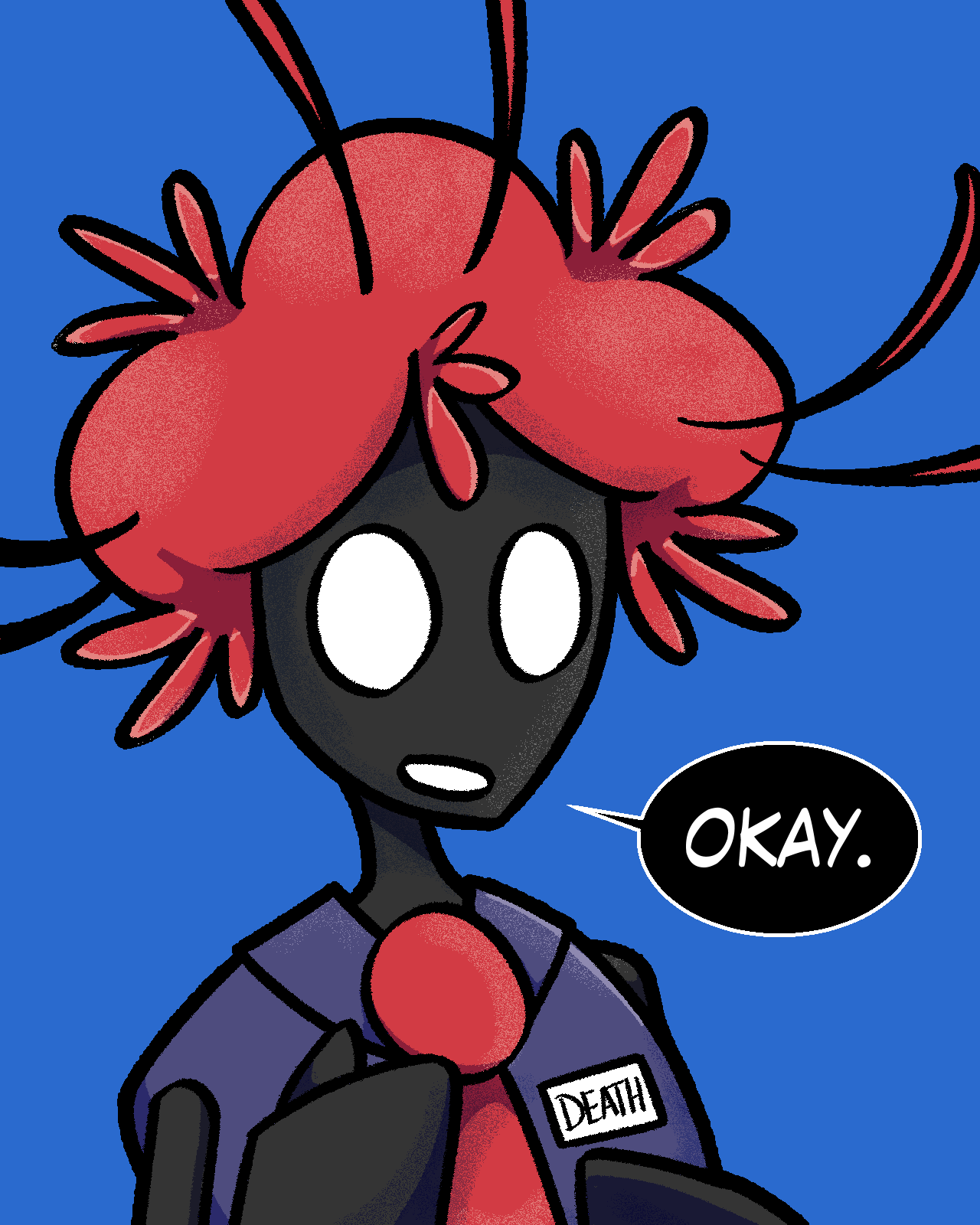
26/02/01 - Death icon
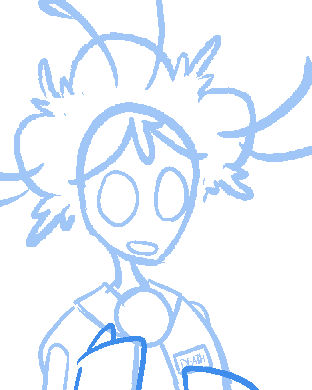
26/02/01 - Death icon (sketch)
This is a character icon I drew for Death to use on UnVale and ArtFight, but I wasn't happy with the linework and rendering. I want my art to look "crunchy," like it came out of MsPaint or was made for older hardware. Not quite pixel art, but closely related.
This here has hints of that, but ultimately came out too clean. I need a rougher lineart brush, and a different airbrush with better pressure control. With the speech balloon, I didn't even try! I have to admit, I was rushing since I wasn't having much fun. I Just wanted to be done with this.
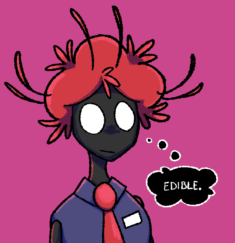
26/02/11 - That is NOT edible
However, this is what I was going for! After that first attempt, I looked into different brushes I could use. I found a free brush pack for Clip Studio Paint called Pixel Doodlers, which had exactly what I wanted.
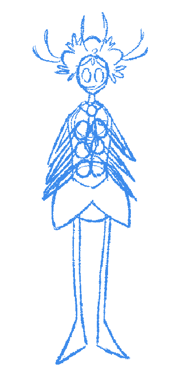
26/02/15 - Death idling (sketch)
I hadn't drawn a fullbody of Death in a long time, because they are hard to draw and make me want to cry. I gave it another shot here, specifically to test out a suggestion by a friend on what Death's "default" pose would look like, when they're not doing anything with their hands. I think this looks a bit too busy with all the arms that close together, but that could simply be the fault of the brush and low resolution. I have to further test this.
Short Sketchbook Detour
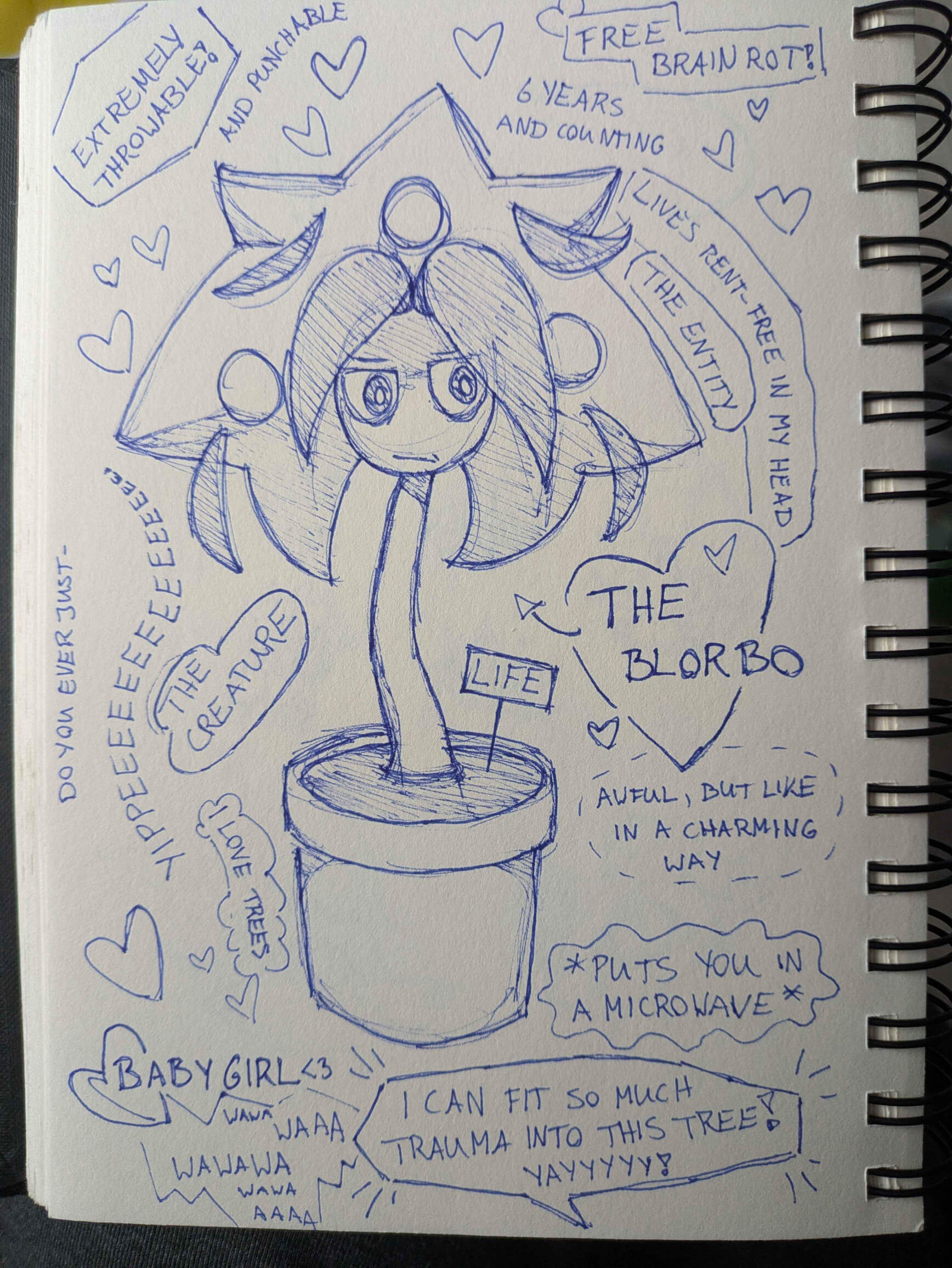
26/02/06 - The Blorbo
My sketchbook making a rare comeback! I felt compelled to doodle a page on paper for once, and that's how this came to be. Behold Life, my favorite punching bag blorbo!
Saya's Fursona
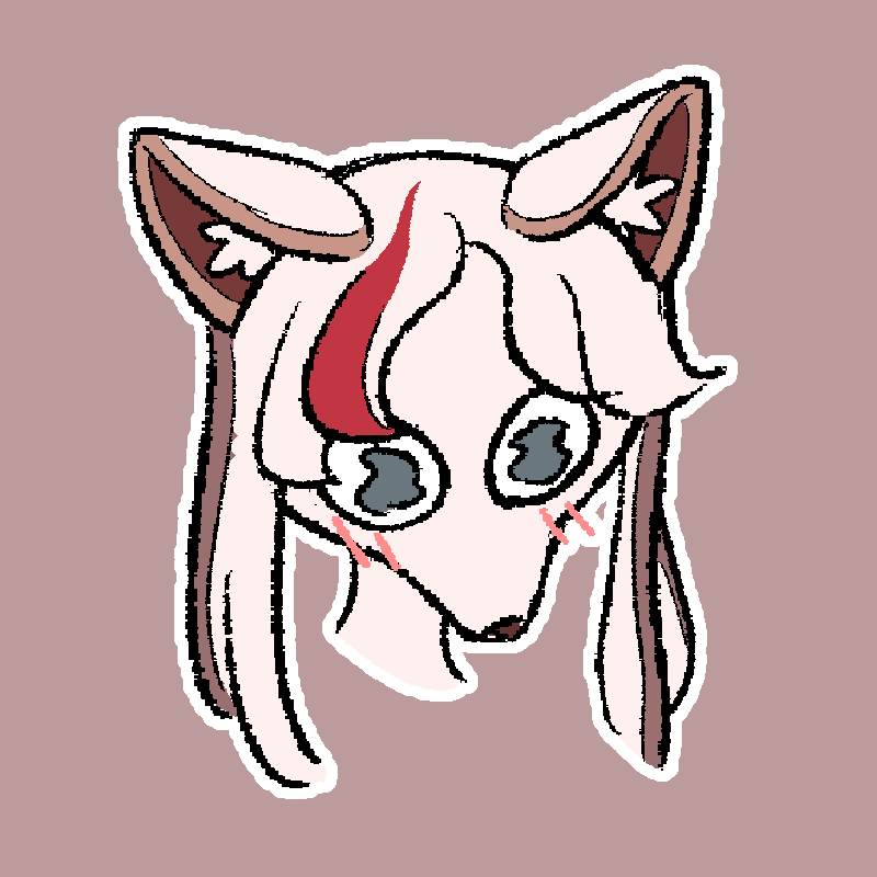
26/02/15 - Saya
My girlfriend visited me for the first time during Valentine's day and stayed the weekend! This is a quick sketch of her fursona that I made while she was visiting. We had an amazing time, and this is one of my better attempts at drawing furry characters.
Fractal Banner

26/02/17 - Fractal Banner (WIP)
Alternative title: Calculating Probability
This is a banner artwork I started working on that I ended up pausing in order to make a character design instead. I've implemented it on my website, it looks decent enough in its current state. Since the color scheme I use on both my website and SheezyArt page heavily favors red and blue, I tried focusing my color palette on those two colors here as well.
(Re)Designing Happiness
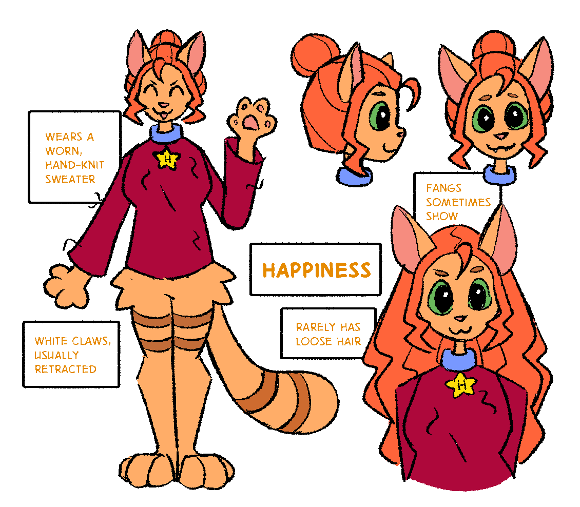
26/02/18 - Reference Sheet: Happiness
My big accomplishment this month: Happiness' reference sheet!
Happiness is a staff member of Existence Inc., a kind and cheerful god of positivity. Her chosen form is an anthropomorphic ginger cat — she identifies as a furry! She has long, curly red hair that she always ties into a secure bun, and wears an old red sweater that she knitted herself.
All staff members are mandated to wear a name tag of some kind; hers comes in the form of a blue collar with a star-shaped tag that has her initial on the front side, and her full name on the back side.
Happiness is never seen frowning. The closest she gets is the occasional pout. She always offers to play games and run activities with her co-workers, but they find her constant positivity a bit grating. There's no one she doesn't consider a friend, but the ones she feels connected to most closely are Depression, Motivation, Anxiety, and Confidence. In other words, all the co-workers that cover emotional aspects like herself.
(Side note: I finally figured out how to make speech balloons and text look "crunchy" in the process of making this sheet! In this drawing, the text color lacks enough contrast to be easily readable, so I need to come back to this soon.)
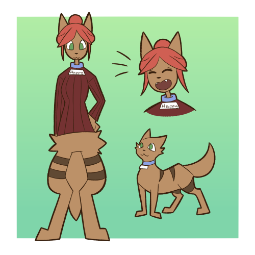
21/01/10 - Reference Sheet: Happiness
This was Happiness' first design.
Well, no— it's her second, but the actual first design is not too different, and I want to go over my early character concepts in a seperate post.
Out of my early designs, Happiness has always been one of my favorites. I think even this version was well done. One thing I like about this design is that Happiness doesn't look childish. It is easy to infantilize cheerful, energetic character types, and my art style in particular has suffered and still suffers from a tendency to make characters look baby-faced. Happiness here comes across as mature, and a bit sassy (a hold-over from her initial character concept). Her color palette is rather dull, something all my early reference sheets had in common, but even back then this was a considerably darker color scheme than you'd expect from a god of happiness. To be honest, I kind of like that unexected contrast it had, and it went well with Depression's design having a similar dichotomy.
Her new design is significantly brighter and more saturated— however, this may be subject to change. I like the color scheme, but I can see areas where it could benefit from minor tweaks.
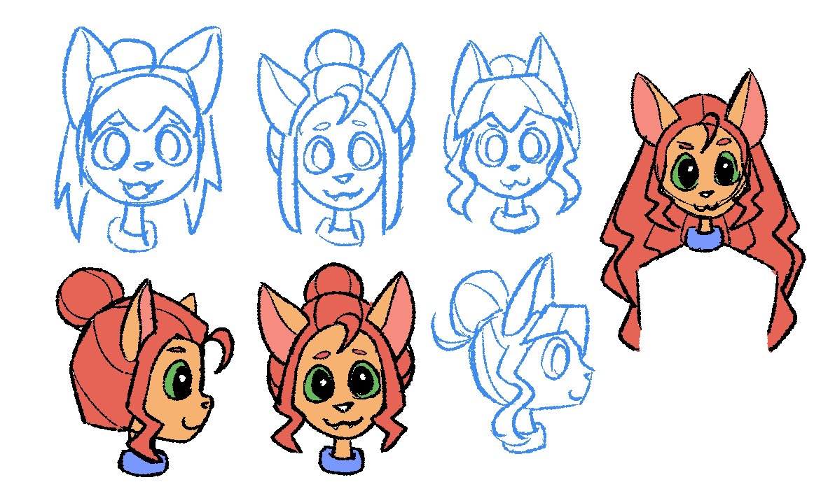
26/02/17 - Design Concepts
For the re-design, the part I initially focused on was Happiness' head, particularly her hair. I went through three sketches before settling on the final design.
First there is short-haired Happiness. This is one I had pictured in my head for a while, but also knew I wouldn't go with. I decided to draw it anyway, to warm up and have it on the page. The reason why I didn't choose it despite liking it is that it makes her look too young; I want her to read as being in her mid- to late twenties if she were a mortal.
The second sketch is closer to her previous design, but without the bangs. At first I found the lack of bangs jarring, but I wanted to give it a chance. They're a common design trope in my characters, so I tried to avoid them here for the sake of variety.
I asked my friends for feedback, and Tog suggested adding the spiky bangs of the first sketch to the second sketch. I did that, while also seeing what it would look like if her side tails were curly. Initially we all ended up preferring this concept, but after letting it sit for a while I gravitated back to the second sketch.
My final iteration uses the second sketch, but with curly hair. This is what I ended up choosing. The reason why I wanted her hair to be curly is that this way she would read as having proper ginger hair- Which, for a ginger cat, is a rather amusing trait.
To complete everything I also drew what her hair would look like if she wore it loose. Then, I cleaned up and colored my final sketches. The colors I chose here didn't make the final cut, but they're close to what i went with.
(Re)Drawing Happiness
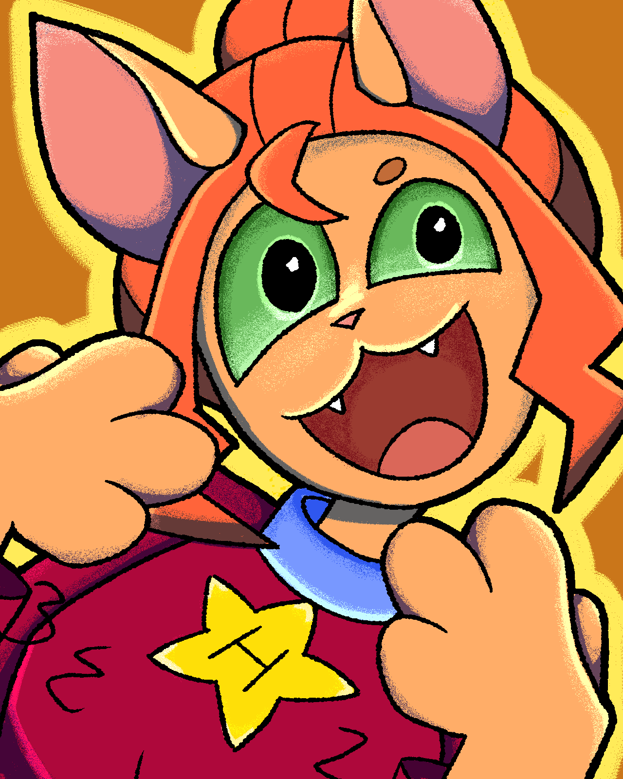
26/02/18 - Happiness icon
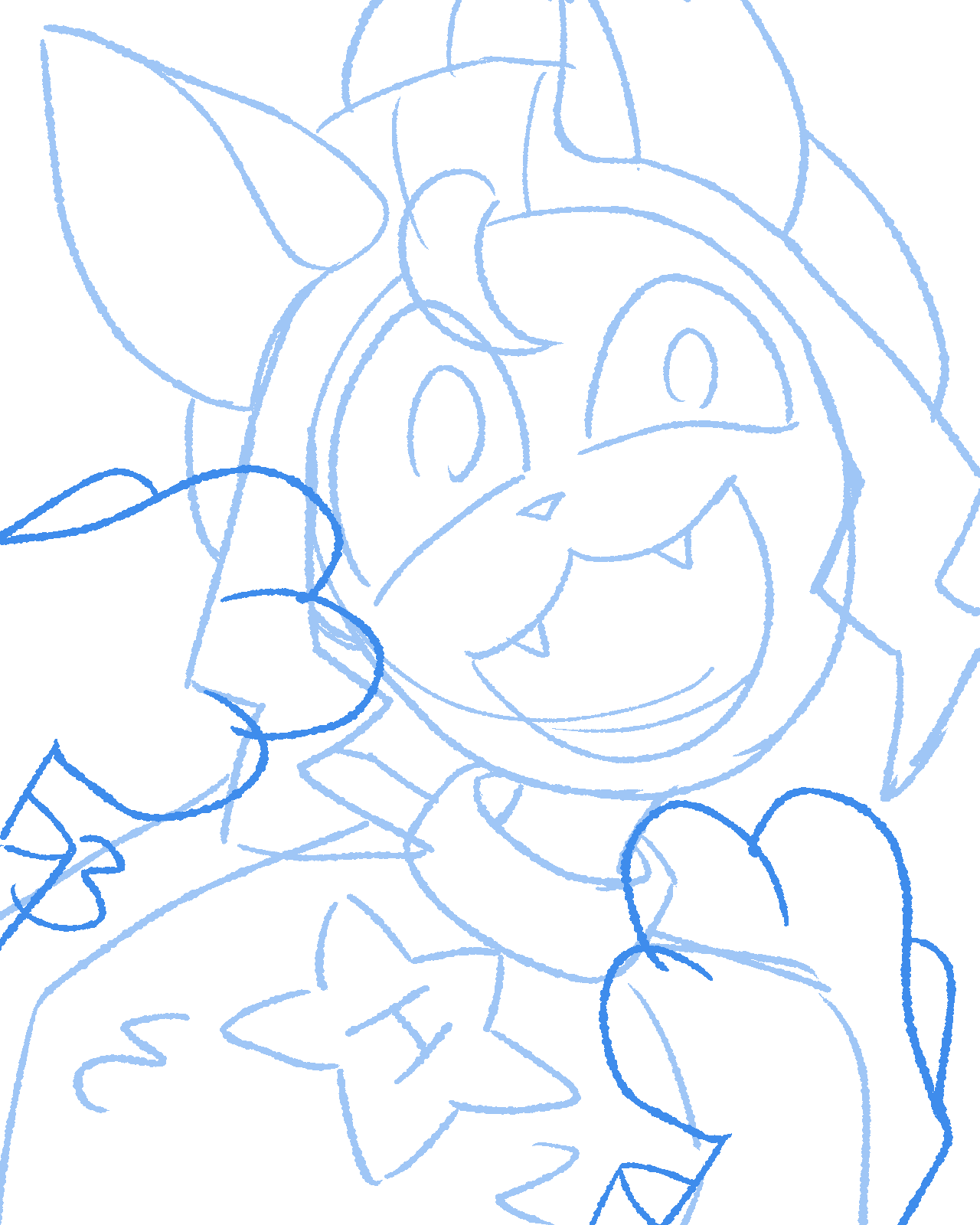
26/02/18 - Happiness icon (sketch)
The 18th was a very productive day! Not only did I finish the reference sheet, I also re-drew an old artwork of Happiness to reflect the design change.
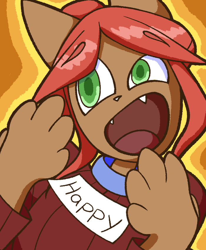
22/03/06 - Happiness icon
This has always been one of my favorite drawings, due to how dynamic and well-compositioned it is. It is not without issues, though. My redraw improved some of them, but is worse in other aspects.
This one, although dynamic, still feels a little bit stiff, something I managed to improve upon in the new version. The main part contributing to the stiff feeling here is her right paw, which I improved by simply making it mirror the left paw.
However, I think the colors are worse in the new artwork. At a distance, it all kind of blends together. That's why I'm thinking of adjusting her color palette in the future. The old design had more contrast, and was thus more readable.
A navigation button for this blog
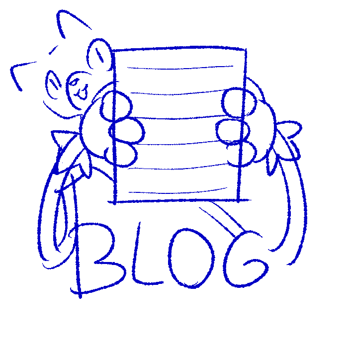
26/02/26 - Blog Button (sketch)
On the homepage, there's currently two sidebar buttons that serve the same purpose as the header links. I attempted to sketch one out for the blog, but I'm not great at drawing my fursona yet. After this sketch I set the project aside for now.
The buttons are a bit redundant, given the header exists, but they look cool.
Limette in Wigglypaint
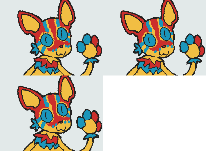
26/02/26
My last drawing this month was a sketch of Limette made in Wigglypaint while chatting to friends in voice chat!